Milton Avery was the 20th century’s great ‘painter’s painter’
America’s most original colorist, the subject of new retrospective at the Wadsworth Atheneum, was inspired by Matisse, and in turn inspired Rothko.
By Sebastian Smee
No single artist shaped 20th-century art more than Pablo Picasso. But there was also, of course, Henri Matisse. And the list of great American painters who looked more to Matisse than Picasso for guidance is impressive.
Another way of saying it, of course, is that the artists in Matisse’s camp — among them Richard Diebenkorn, Lee Krasner, Willem de Kooning, Mark Rothko and Milton Avery — looked more to color than to line. But that sounds too bloodless and cool. There is an emotional heat in the affinity these artists felt for Matisse — even those who also learned from Picasso — that encourages a critic to keep it personal.
Avery (1885-1965), who is the subject of a traveling retrospective at the Wadsworth Atheneum Museum of Art in Hartford, Conn., was compared to Matisse (1869-1954) more than he might have liked. The connection, however, was undeniable. Avery composed with large areas of flat color, creating depth with color contrasts and harmonies instead of shifts in scale and linear perspective. He applied paint thinly (according to art historian Marla Price, in the exhibition’s catalogue, Avery “boasted that he could make a tube of paint last longer than any other artist”). And he resisted abstraction, preferring to paint landscapes, still lifes and figures in front of the motif.
All these characteristics define Matisse, which clearly wasn’t a coincidence. But Avery demurred. “Some critics like to pin Matisse on me,” he said in 1916, “but I don’t think he has influenced my work.”
Artists do this. They try to suppress discussion of the most obvious connections between their work and that of their heroes. This is entirely reasonable. It’s a question of survival, of being able to breathe, of establishing, by fiat, permission to be oneself. In their shoes, you would do the same.
We don’t need to take them literally. But in Avery’s case, things get more interesting once the connection with Matisse is registered — once you admit that what’s at issue in his work derives almost entirely from Matisse’s discoveries about color. As your sense of it deepens, Matisse sort of floats away into irrelevance. As the greatest and most inventive of colorists, the Frenchman created the conditions of possibility for Avery. But the colors the American used, and the things he did with them, were utterly original.
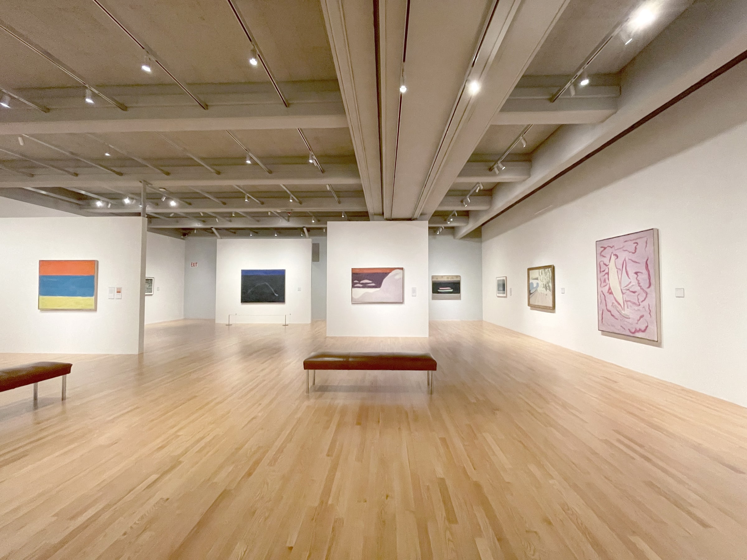
The Hartford show, which opened in Fort Worth at the Modern Art Museum and will travel to the Royal Academy in London, is a treat. Loans from major museums are fleshed out with rarely seen paintings from private collections and the Milton Avery Trust.
The exhibition opens with a gallery tracing Avery’s development as a young painter responding, in a loose, Impressionist manner, to the landscape around Hartford, where his family moved in 1898, when he was 13. He worked in factories in his late teens and 20s before enrolling in art school in Hartford, at the time one of America’s wealthiest and most cosmopolitan cities (and still home to one of its greatest museums).
In 1925, Avery moved to New York City and married Sally Michel, a freelance illustrator for the New York Times and Macy’s department store. It was her income that freed him to pursue painting. He produced gritty urban scenes in a relatively dull palette. His eye was drawn to cheap entertainments — circuses, vaudeville theater, auctions and — inevitably — Coney Island.
But by the 1940s, Avery had figured out that the point of it all, for him, was color. His work began to sell to such major collectors as Duncan Phillips, Albert Barnes, Roy Neuberger and Joseph Hirshhorn. He responded to his success by ratcheting up his rate of production.
Avery was a Yankee with a muffled, mustachioed sense of humor. His farm animals suggest wry affection, and his portraits have a fond, offbeat quality. At a time when the talk around art in America was giddy with rhetoric, baiting nothing less than spiritual transcendence, he would (according to his daughter, March Avery Cavanaugh) infuriate his fellow painters by referring to art as merely “a fascinating pastime.”
Masterpieces from the period include the Wadsworth Atheneum’s “Husband and Wife,” which epitomizes Avery’s brilliant, counterintuitive color sense, and the Metropolitan Museum of Art’s “Swimmers and Sunbathers,” with its striped, horizontal composition setting khaki green foliage against slate gray water and a mauve beach. All this he punctuates with off-white and milky blue rocks and a bright red swimmer like a red cardinal catching fire above the water.
Wonderful, too, are “Rooster’s Domain,” which sets a rooster painted in five shades of blue against nondescript browns and grays sprinkled with reds, and “Still Life (Blue Bowl With Nuts),” which ignites chocolate brown with sky blue, harmonizing the two with a touch of pale yellow and a delicate lavender.
You can only try to describe Avery’s colors, knowing in advance your attempts will crumple like a spinnaker turned into the wind. The cover of the catalogue, which reproduces a rare late painting that is basically abstract, is no help: It sets black against an orangy red, yellow and blue, the three primaries.
The choice is perverse. Avery’s favorite colors were to primaries what Ravel is to Bach. He loved, instead, in-between, indeterminate hues: mauve, lilac, acid green and aubergine. He adored beige, brown, off- white and mustard — colors you’d struggle to find on a color wheel. He sometimes set them against trumpeting reds, yellows and blues, yes, but only to create close, jangly harmonies that linger on the palette like licorice or cardamom.
He often applied cool colors with a light touch oxygenated by warmer hues coming through from beneath, in a manner that clearly influenced his friend Mark Rothko (famous for his rectangular “lozenges” of color variously warmed and cooled by subterranean hues). He overlaid some areas with fuzzy patterns to create areas of higher pressure that contrast with large, low-pressure expanses of pure, saturated color.
Avery’s drawing is naive, expansive and free. He was open to the sorts of decorative deformations pioneered by Cézanne and Matisse, and, like Matisse (and unlike Picasso), his compositions are centrifugal rather than centripetal: They push beyond the picture frame and occasionally against gravity.
From the 1940s on, the painter’s figures — often female figures presented in pairs — tend to have heavy bottoms and small heads, creating triangular shapes that appear to cross Cézanne’s gauche bathers with Amedeo Modigliani’s suave, spreading nudes. The alloy is odd, but somehow, again, it works.
Where Cézanne and Matisse were ultimately classicists seeking deeper harmonies, Avery was more of a mannerist. There is something belated and a tad whimsical about his style. But it is exactly this oblique and private quality — an obedience to the demands of an inner life so rich and original that it can’t fail to beguile — that makes his art so alluring. The same quality explains why he was — and continues to be — so loved by other painters.
Milton Avery Through June 5 at the Wadsworth Atheneum Museum of Art, Hartford, Conn.
March 16, 2022